How to design a professional logo for your blog
Your website or blog logo is an essential part of creating your business branding. It’s something that will always be at the centre of your business and as such, it needs to be carefully thought through. Depending on your budget, you might like to skip the DIY version and leave it to the professionals, but since we approach everything with frugal thinking on this blog, I’ll show you how to create your own logo.
reasons for creating your own logo
- If you are not quite sure what your branding is or it’s not completely finalised, the creative process of creating your own logo can help to clarify this
- You can’t afford to spend a lot of money on a professional logo design
- You need a temporary logo and avatar now (for your website and social media)
- You fancy having a go yourself and you have the time to learn a new skill
- You can change your new logo any time you need to as your business or blog grows or changes
For me, creating my own logo is not so much about saving money, but about not knowing what I actually want, as my blog is still new and I prefer to develop my branding as I go.
Over the years I’ve created all my business logos (apart from the first one!) and each logo went through a few changes as my blogs and business developed. Because of that, I’ve picked quite a few tricks on how to create a logo, which looks the part and more importantly looks like it’s been created by a professional.
Tips to create your own logo
Your logo needs to reflect your blog or business
This goes without saying, but you need to create a logo that extends your branding and not end up with something that it very different to your blog or business, which could be a bit confusing for your readers and customers.
If your blog is about parenting and children a playful & colourful font with a child like design will be completely appropriate. But if your is blog is about more serious matters like mental health, the same style of logo might look out of place.
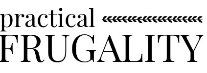
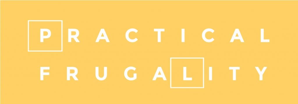
My blog is still changing, but I wanted my logo to be modern, simple with a bit of sophistication. After many hours, I’ve decided on this design as my final (for now!).

When I started the blog, I couldn’t decide on anything, so my logo was just this:

Keep things simple
The most important thing in your logo design is your blog or business name. That needs to stand out the most and everything else is ‘garnish’! It always amazes me, how many people choose lots of ‘frilly bits’ (you can tell I’m no designer!) that completely obscure the name of their blog.
Start with an empty screen with just your blog name and then add more elements if you really think the logo would benefit from it.
Choose the right fonts to use
You can find your font free to use online and there are plenty to choose from like DaFont, FontSquirrel, Urban Fonts or FontBundles (which is a great alternative to Urban Fonts).
Use the same fonts in your logo design as on your blog or website. You can either pick a font that you like and one that represents your blog best, design your logo and then use the font on your blog. Or if you have fonts already fixed or selected for your blog, use the same fonts for your logo.
If you are using fancy fonts in your logo, use them also for headings on your blog. Depending on the readability of the font, you could assign the font to H3 or H4 headings (rather than H2 headings which are used frequently) and use it for some headings or quotes on your blog.
Stick to a maximum of 2 fonts or use just one with modification for upper case or italics.
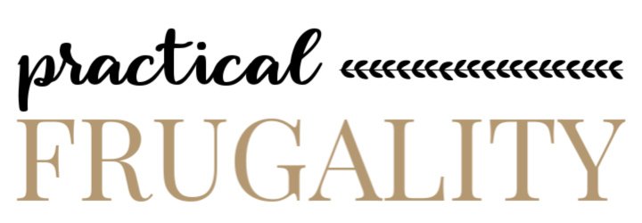
Choose fonts that compliment or contrast each other. If you choose fonts that are too similar, they will just look wrong.
Try to play with different font sizing before you add an extra font. Sometimes you can achieve a great effect by just stacking the letters or making one part of your name shorter by making the font smaller.
Choose your colours
To make sure that your logo looks professional, use the exact hex codes to get the colours looking the same. Again, if you have colours already set up on your blog, that you are happy with, use these, or alternatively choose new colours for the logo, but then you need to be able to change the colours on your blog too, to go with your new logo.
Details are important
Make sure that everything is perfectly lined up and the right size. To do this make sure that you work on a large computer screen and use your software line guides or even a measuring tape.
Size & Resolution and Type of your logo
Depending on your blog and social media requirements you will need to check what size your logo should be. You’ll find it in your theme documentation and check online for social media profiles sizes as these keep changing a lot.
To make sure that your logo looks sharp and clear, you need to create it and upload it at least 2x the recommended size. My theme suggests 750px by 250px, but yours might be slightly different.
Once you design your logo and create the right size, make sure that you upload it at the highest resolution and keep both png and jpg versions. I use png version for my blog as the logo looks a bit sharper.
You should also download the logo with a transparent background option. Even if your website has a white background, always download the logo with transparent (and not white). Again this will ensure the best display and will blend seamlessly into your blog. Plus if you do decide to add your logo on a coloured background or blog you won’t need to re-edit the logo background.
PIN THIS FOR LATER